Great offices do more than seat people. They signal purpose, lower stress, and make decisions faster by reminding everyone what matters. Wall art is one of the simplest ways to do this. Chosen well, it clarifies your brand, supports culture, and looks polished on camera. Chosen poorly, it creates visual noise that distracts visitors and teams. Use this step by step guide to select professional office art that works in real life and reads beautifully on video calls powered by modern office canvas prints. Learn how to select professional wall art for offices that aligns with your brand and company culture.
Start With Brand, Culture, And The Moments That Matter
Begin with your brand narrative and the behaviors you want to encourage at work. Write three short statements. Who we are, how we serve, how we win together. Translate each statement into visual qualities. Calm or energetic, minimalist or layered, playful or serious, local or global. This quick vocabulary keeps taste debates short and helps your selection team say yes for the right reasons.
Map the key office moments you want art to support. First impressions in reception, focus in work zones, collaboration in project rooms, pride in executive areas, community in shared kitchens, clarity in hallways and wayfinding. Art should earn its place by improving one of those moments.
Build A Visual System, Not A Pile Of Prints: Wall Art for Offices
Random posters feel temporary. A visual system feels intentional. Define a primary palette that complements your brand colors, a secondary palette for accents, and one metal or wood frame finish that repeats from space to space. Plan formats by zone.
Large canvases create a focal point in reception. Triptychs calm long corridors. Grids of smaller frames tell stories near meeting rooms. Repeat spacing and align edges with nearby architectural lines so every wall looks designed, not improvised.
Choose Formats That Photograph Well And Age Gracefully
Most office art will be photographed in headshots, event photos, and daily video calls. Favor materials that avoid glare and survive cleaning. Canvas prints are forgiving near windows and key lights, they work in open offices and on camera. Framed photographic prints with low reflection acrylic look sharp in boardrooms.
Metal prints offer saturated color for statement zones and stand up to high traffic. Illustrated charts and branded typography can live in strategy spaces and research labs, as long as they remain timeless and easy to read.
Match Content To Space And Stakeholder
Reception welcomes and orients. Pick one piece that speaks for the brand. Executive rooms host high stake decisions. Choose work that projects clarity and confidence, not novelty for novelty’s sake. Focus areas need quiet. Use texture, muted color, and simple compositions. Huddle rooms benefit from more energy and directional lines that point people inward to select wall art.
Client corridors are a gallery for case studies and community stories. Production or lab areas reward functional visuals such as process diagrams or local maps, presented as art.
Size, Placement, And Spacing That Always Look Right
Measure the wall, then set a target width for the piece at roughly two thirds the width of the furniture below it. Center art at eye level for standing or seated viewers, depending on the room.
A common center point is about one hundred and forty five centimeters from the floor in circulation paths and about one hundred and thirty centimeters above seating. Keep spacing tight enough to read as a set, loose enough to breathe. For series, leave a consistent gap between frames and align tops or centers to one clean line. Use painter’s tape to mock positions before you drill.
Use Color Intentionally, Support Mood And Brand
Color choices do more than decorate. They support focus, signal brand, and influence how visitors feel in the first five seconds. Cool neutrals and gentle blues calm focus spaces. Warmer neutrals with small saturated accents can lift morale near collaboration areas.
If your brand leans bright, use color in controlled doses so screens and signage do not compete. Study color psychology and your brand guidelines side by side, then choose art that pulls from the same family without copying the logo. This creates harmony rather than repetition.
Wall Art for Offices: Balance Originals, Limited Editions, And Prints
Original art brings craft and story. Limited editions add scarcity and polish without the cost of unique pieces in every room. Ready to hang canvas prints deliver speed and consistency across many locations. Mix formats with intention to select wall art.
One large original or commissioned piece in reception, editions and framed photographs in boardrooms, canvas prints and brand stories in work zones. Keep documentation of artists and sources, then rotate pieces annually in public areas to keep the space fresh.
Tell True Stories About People And Place
Culture grows through specific stories. Feature local photographers, community landscapes, or archival imagery that shows your history and the neighborhoods you serve. Turn case studies into elegant, word light wall graphics that celebrate client outcomes.
If you operate globally, curate a set of city abstractions or material textures from your markets. People do better work when the walls reflect a shared journey rather than generic stock art.
Budget, Procurement, And Maintenance That Scale
Set a per meter budget for art across your floor plan so choices stay balanced. Include frames, delivery, hardware, and installation in one number to select wall art.
Create a short vendor list for canvas prints, framing, and installation, then standardize finishes and hardware so replacements are pain free. Keep a maintenance plan. Dust gently, avoid direct sun for delicate works, and log each piece with dimensions, source, and a location photo. Clear process protects investment and makes expansions simple.
Wall Art for Offices Acoustic And Lighting Considerations You Will Feel
Open offices echo. Canvas and fabric wrapped panels absorb sound and can carry brand aligned art without adding noise. Position art where indirect light can reveal texture.
Avoid direct downlights that create hotspots. Add picture lights only when a wall functions as a feature. In rooms with video calls, test the background on camera. Remove busy patterns that strobe or moiré. Small lighting tweaks often improve both comfort and image quality to select wall art.
Accessibility And Inclusivity Are Part Of Good Design
Art should welcome everyone. Maintain clear floor space near walls for mobility devices. Keep high contrast between art and walls where helpful.
Provide simple labels that name the artist and subject in readable type. Avoid themes that exclude or stereotype communities. If you present text as art, confirm that content makes sense for an international audience and that translations are available where needed. Inclusive choices build trust before a meeting begins.
A Practical Selection Table You Can Use With Stakeholders to Select Wall Art
| Space | Purpose | Recommended Format | Palette Direction | Size Guideline | Notes |
|---|---|---|---|---|---|
| Reception | First impression, brand story | One large canvas or framed photographic print | Brand neutrals with one accent from your palette | Two thirds of console or sofa width | Place at standing eye level, add discreet picture light if wall is feature |
| Boardroom | Confidence, clarity | Framed photograph or limited edition print with low reflection glazing | Calm neutrals, restrained color | Two thirds of table width, landscape orientation | Avoid busy patterns that compete with slides |
| Focus Area | Quiet concentration | Canvas texture or soft abstract | Cool neutrals, low contrast | Single medium piece, square or portrait | Place so it does not reflect in primary monitors |
| Collaboration Room | Energy and alignment | Triptych or grid of small frames | Warmer neutrals, a few saturated accents | Three pieces spaced evenly across main wall | Choose directional lines that draw eyes inward |
| Corridor | Wayfinding and culture | Series of small framed prints or case study panels | Mixed, tied by one frame finish | Align tops, maintain consistent gaps | Add small labels with artist and project names |
| Pantry Or Lounge | Community and pause | Playful photo series or local illustrations | Natural tones, friendly color pops | Multiple small pieces or one large square | Use wipeable finishes in high traffic zones |
A Simple Vendor Brief That Gets Better Art
Create a one page brief for every order. Include photos of the space, wall measurements, furniture dimensions, brand palette, frame finish, and the mood or behavior you want to support. Add two or three visual references that show direction. Share rules for glare, reflection, and camera backgrounds. Ask vendors to present two options per wall with mockups to scale. Decide quickly, then move to installation with prebooked time slots to avoid project drift.
Mini Background Paragraph For Video Friendly Walls
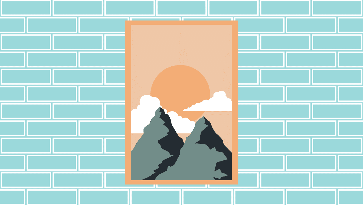
Work zones perform better with clear lines and controlled contrast. Start with modern office canvas prints in quiet palettes, soft blues, warm grays, natural neutrals, that stay readable on video. Position art so it fills the top third of your webcam frame without cropping; test reflections from windows or key lights, canvas helps keep glare low.
Choose portrait for narrow columns beside shelving, landscape to stabilize wide spans behind a desk, and square for centered balance above a credenza. Keep spacing 5 to 8 cm for pairs or triptychs and repeat one frame finish, black, oak, or white, to keep the setup cohesive.
Measure What Works, Then Improve Wall Art for Offices
Turn taste into numbers so decisions get easier over time. Track three signals for three months after installation. Visitor comments in reception, meeting feedback about glare or distraction, and survey ratings for workspace comfort.
If a piece draws consistent praise, replicate its qualities in other rooms. If glare or reflection interrupts calls, adjust lights or swap finishes. Art is not a one time decision. It is an evolving system that supports brand and culture as teams grow.
Final Checklist Before You Order Wall Art for Offices
- Confirm palette alignment with brand guidelines.
- Measure walls and furniture, record center points and outlet locations.
- Choose one frame finish for the entire floor to select wall art.
- Pick formats by room, canvas where glare is likely, framed prints where you want crisp detail.
- Mock up scale with painter’s tape, take photos from seated and standing views.
- Book installation and keep extra hardware on hand for future moves.
- Document sources, sizes, and locations for easy maintenance and expansion.
Thoughtful wall art makes offices feel intentional, sets a professional tone on camera, and keeps culture visible without a single speech. Choose with purpose, install with care, and review results with your team. Your walls will work as hard as your people.